
The world of telecoms is all about communication and making it as smooth and comfortable as possible. This goes beyond the basics of user experience and sound – it’s also about how things look and what we have to say. In other words, design is as paramount as a good product. Let me tell you a story about how this blog was created, its creators, and our inspiration regarding the tools that help us communicate every day.
Introduction
When we decided to design and implement our content strategy, we knew we needed someone special for the job. We had always been lucky with great developers, but never had someone who could tell our stories with the passion and drive we wanted.
This is where Hennadiy Kornev, our content manager, came in. A content manager must help build the brand’s identity and online presence by creating written, visual and other means of communication that match the brand’s intended image. A good content manager must have creativity and an analytical mind, be perceptive in both visual and language cues, and at the same time be a team player and someone who’s unafraid to speak their mind.
When we met Hennadiy, it was clear from the start that he was right for the job. Hennadiy was truly passionate about content and helping us craft our story. And of course, he knows his stuff, always asking a lot of questions and generating new ideas. Most of all, he doesn’t hesitate to share his opinion or offer a different direction for our content to go.
Our first task with Hennadiy on board involved setting up the PortaOne blog. Launching this telecom blog is a part of our content strategy to reach our customers, keep them informed, and bring them together. We had quite a few things to consider as we tackled this project: choosing a name and logo for the blog, finding the right platform, and coming up with a good design. And it all had to fit our brand.
Work
Choosing the Platform (the problem)
The first thing to do was to decide on which platform to use. After reviewing all our options, we decided on WordPress. WordPress is a great tool for building websites, being free to use with high customizability and lots of extensions. WordPress is also used by millions, making it easy to use and to find someone who can manage our site. We chose the Johannes theme, for it looked particularly promising and fresh compared to the other themes we viewed. Once we’d selected our theme, we started to get to work on incorporating and adjusting the theme for our needs.
WordPress themes look fantastic at the first glance, and that’s just the problem – the designers behind them do well pimping them out with nice fonts, colors, and professional photos, and the right balance of text, visual accents, and white space. But the minute you start changing things – adding your own photos, changing font sizes, and so on – everything starts falling apart.
When it came to organizing the front page, Hennadiy didn’t want a static front page with descriptive text; he wanted nothing but blog posts. The text and images of each post would hopefully entice the visitor to read more on any one of the topics showing up on the main page. But we weren’t happy with the initial result. It was a rather boring, bare-bones site with only rectangular images and paragraphs of text, as you can see below. 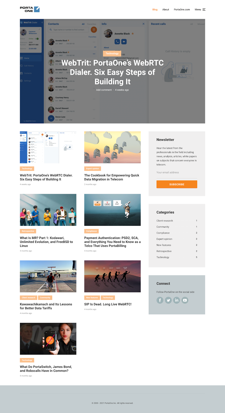
Unfortunately, it had to do for the moment, as we had other issues to address as we prepared the site.
The name
Another basic problem was the name. Should we call it simply the PortaOne blog? Or go for something a bit more creative and clever?
Hennadiy strongly advocated for a different name, as it could stand out in people’s minds (and in searches) more than a generic no-name blog. One of the first suggestions Hennadiy brought up was “The Switch” – the name related to our key product, PortaSwitch, and the term clicked with both techy and artistic types. But it didn’t sound quite right, and didn’t accurately reflect our brand.
Other ideas included The Portal, Converged, The Cluster, and The Connector. After some brainstorming, debate, and a vote, we settled on The Connector. The name most closely represented our mission as a telecom company: to connect people and business together.
The Icon
What is a product logo/icon
We next needed to decide on a logo for our site. Product logos are an essential aspect of communicating the company or product brand – they serve as the face of the brand and are often the first thing that comes to mind when customers think of the company. The distinctive VW logo or the blue-and-yellow IKEA emblem, for instance, are practically synonymous with their brands.
Because it can stick in customers’ minds, the logo can be a very powerful image, communicating personality, quality, and even provoking emotion. The logo symbolizes what the company stands for and its connection to customers.
Icons have a more specific function than logos. An icon is a more abstract, artistic representation of an action or operation that is immediately apparent to the viewer. Facebook’s “like” icon, for example, instantly communicates the action of liking a post with a thumbs-up symbol, while also communicating something about the brand.
While logos have more wiggle room in terms of design, icons tend to be designed quadratically and to fit specific dimensions, constraining the range of shapes and sizes they can appear as. A company or brand usually has only one logo, but there can be many different icons representing different aspects of what the company offers. Google, for instance, has a different icon for each of its many different services.
The Connector icon iteration
In our case, we wanted to create an entirely new icon for the blog to distinguish it from our other telecom products and services. But we also wanted the icon to be consistent with our brand.
Before designing the logo for the new blog, we looked to PortaOne’s brand book, which covers how we want to present the PortaOne brand. This includes the company’s textual and visual presentation: our color scheme, voice, values, and typography.
The brand book specifies that icons should be simple and consist of outlines, symbolizing simplicity and connection. So the look was clear. But what could the logo for the Connector represent? We started brainstorming some possibilities. Below is the first version of the logo we came up with.
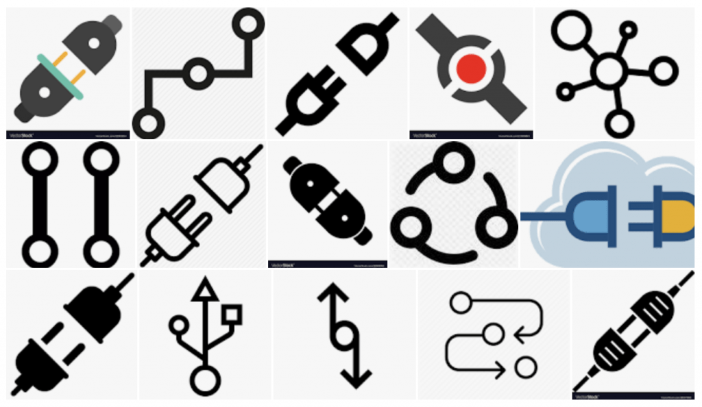
Why did we start with a plug? Before creating a new icon or logo I always do research, including a Google search on images representing the term connected to our image. Below are the results of searching “connector icon”: a lot of electrical plugs showed up, so clearly it was strongly issued with the idea of a connector.
But I felt the image of a plug didn’t suit our brand. It had the wrong connotation for connection – that of a man and woman being together – that we didn’t want affiliated with our brand. Plugs are also more associated with home appliances, which is not our line of business, so again it seemed inappropriate for a telecom logo.
In the meantime, Hennadiy had produced a few more comprehensive and exciting posts. In these posts he had a tone that suited our brand just right, and he covered a lot of history and how things work in the telecom industry. This got me thinking about a printed circuit board (PCB) pad, a place on the surface of a board to which a component is soldered. Circuit boards are among the most fundamental components of electronics, existing to connect things together, suiting our brand just fine.
For our logo design, I considered in particular the PCB pad: portions of exposed metal on the surface of the board to which components are soldered. These pads come in two shapes: circles and squares. PCB designers use round pads on the circuit boards and square pads are often used to indicate pin 1. The image of a pin connecting different components was analogous with PortaOne, and could call back to the PortaOne logo. Below you can see the final image, inspired by PCB pads.

Back to the platform and fixing the problem
So we had a logo, name, and platform ready to go, but we still had to tweak the website to get the look right.
A friend from Slovenia introduced me to Elementor, a WordPress plugin that helps you design and build a website to maximize its attractiveness and usability. There are over a dozen reasons to use Elementor, most of all its user-friendliness, endless design possibilities, and useful customized content widgets with drag-and-drop functionality. The experience was smooth and easy. Once Elementor was in place, designing the new blog for PortaOne became a joyful ride and was complete in three days.
Conclusion
Designing a website is not a quick-and-easy undertaking, if you want to do it right. It is, in fact, an art (here’s proof – amazing page connecting art history with web design), conveying specific meanings to the visitor. Isn’t it better, then, to approach web design with intention, so that the visitor clearly understands what your website is about? We put a lot of hard work and care into building this new blog, and we’re quite pleased with the result. And we hope we have inspired you to take on a new approach to designing your website and crafting your brand. If you have any questions about the design, process or branding feel free to contact me
About the post date
While this post was written in April 2021, I wanted it to be the 1st post, so I set the post date to Jan 1 1980. I’m old enough to remember the days when you reset or unplugged a home appliance (such as a VCR), the date went to this default setting. And because we are resetting the system, in a way, by creating a new blog, this date seemed fitting.
My sincere thanks to everyone involved in this gratifying project, including Matjaž Razbornik for taking care of technical stuff (WordPress included), and much appreciation to Danielle Bodnar for helping me write and proofread this post.